Jeff Gothelf
Platform
Wordpress
Agency
Automattic
Role
Design
Completed
2023

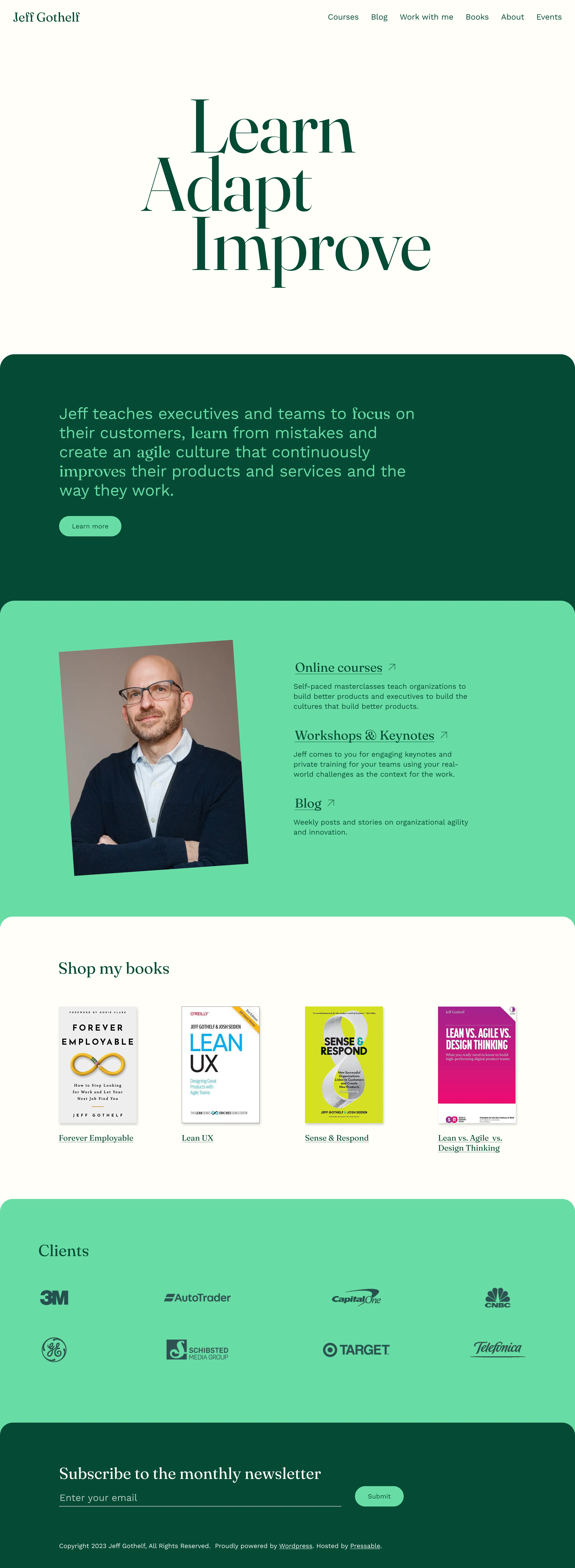
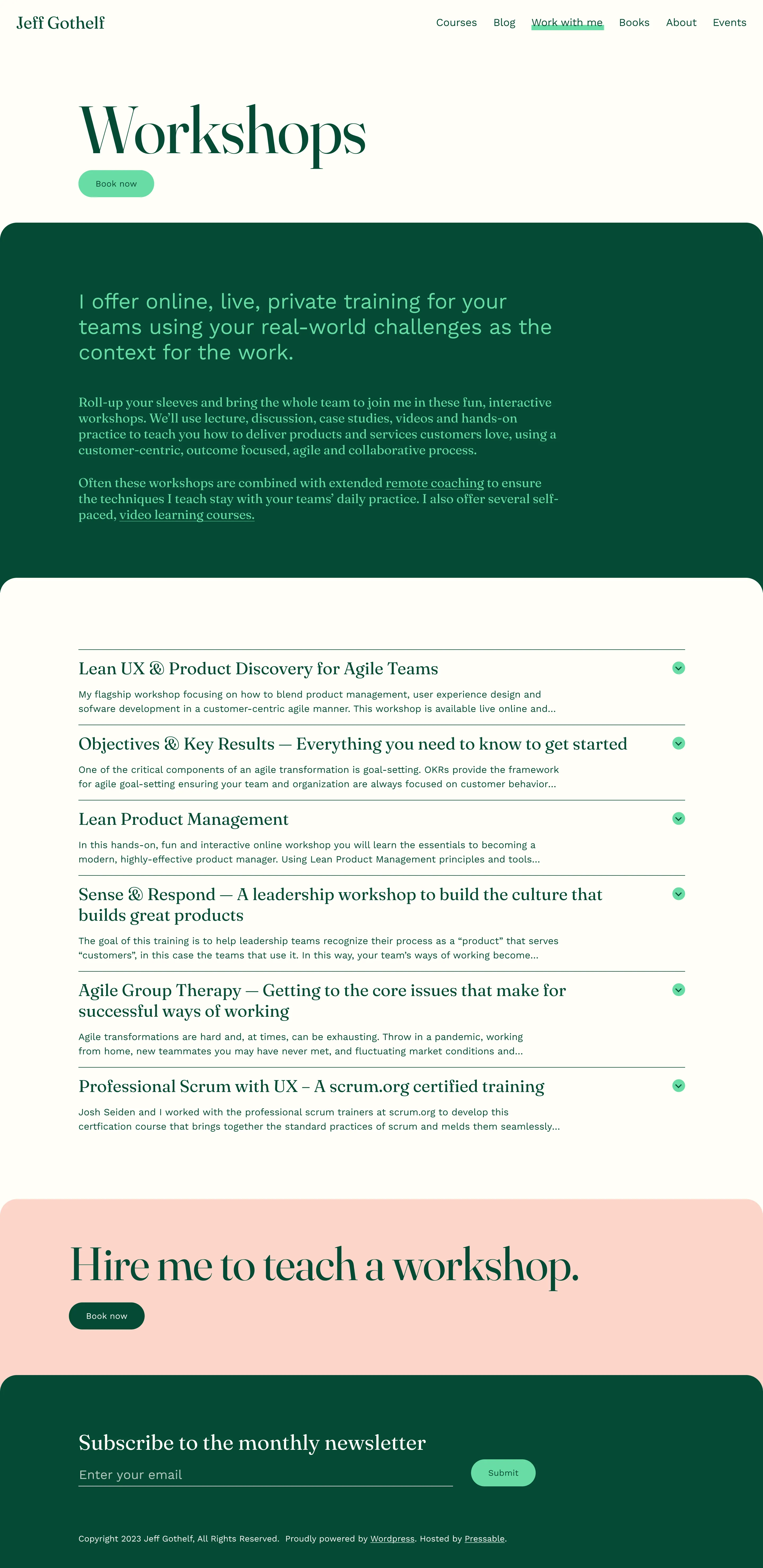
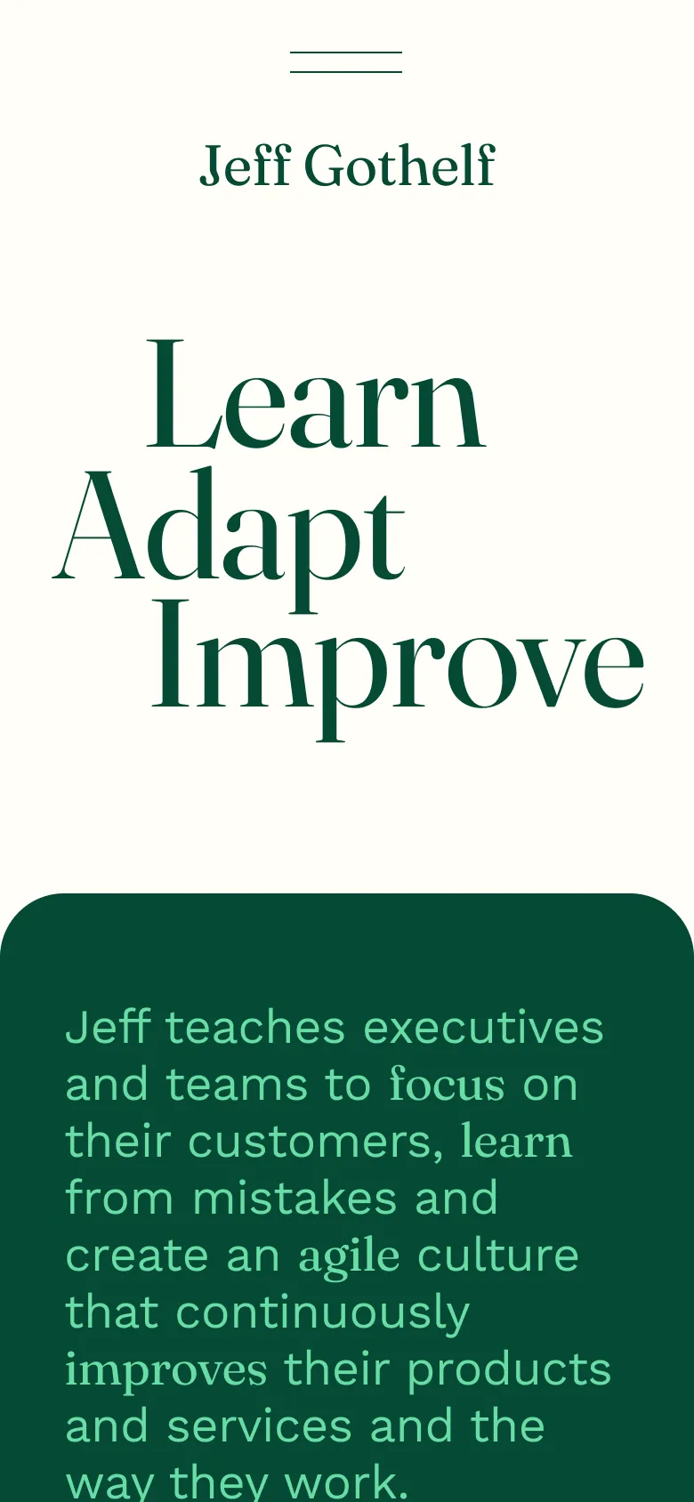
Jeff Gothelf needed a revamped website to better organize and showcase his various offerings. His site needed to engage his users while improving their experience to more immediately undestand and engage with his offerings. Jeff's courses and keynotes all bring an element of fun to his content which we wanted to reflect in the design with some bright colors and animations.


